Tutorial: Point & Figure charts
This is a brief tutorial on Point & Figure charts in ShareScope.
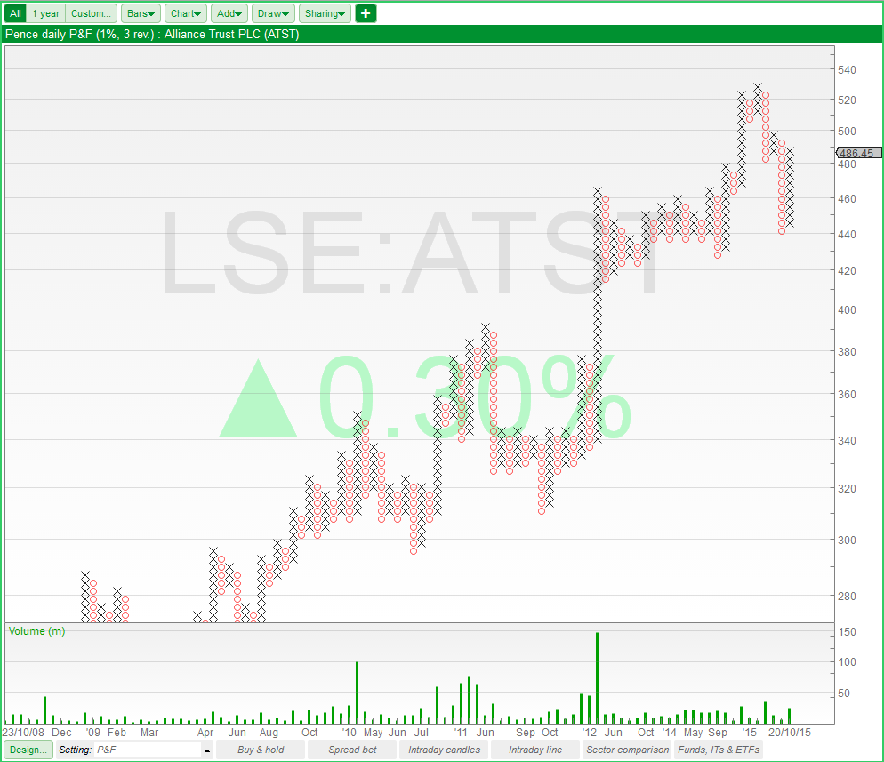
What are Point & Figure charts?
A Point & Figure chart (P&F) is displayed as a series of columns of either Xs or Os, giving a graphical representation of supply and demand. A rising price is represented as a column of Xs; a falling price by a column of Os.
P&F charts are constructed using a Box size and Reversal amount. Each X or O occupies what is called a Box (P&F charts were originally constructed on graph paper). The Box size refers to the value that the price must change in order for a new box to be filled.
For example, if the Box size is 2p and the latest column is constructed of Xs, then for each 2p increase in price a new X is added. In P&F only these values, not the prices in between, are recorded. P&F charts aim to display only significant price movement.
Time is irrelevant on the P&F chart. A column of Xs or Os could represent one day, several days, months or even years.
Columns change from X to O (and vice versa) when the price direction changes by the Reversal amount multiplied by the Box size.
Continuing our example, if the reversal amount is 3, the price will need to fall 6p (3x2p) for a column of Os to be started. New Os would be added with every 2p fall in price until the price rose by 6p (3 x 2p) at which point a new column of Xs would be started.
For more information on Point & Figure charting we recommend "The Definitive Guide to Point & Figure" by Jeremy du Plessis. Our approach to price targets are based on this book.
Getting Started
To set your graph to Point & Figure, select the corresponding item in the  menu. Detailed options can then be found by pressing the
  button in the bottom left corner of the view. The following dialog box will appear:
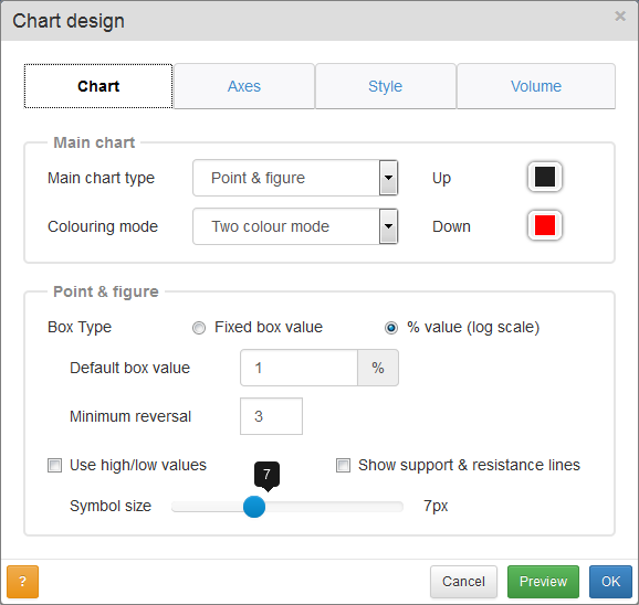
You can set the colouring mode to either single or two colour mode. In single mode only one colour is used, while in two colour mode the Xs and Os are coloured separately using the Up and Down colour respectively. Click on each colour box to change the colour used.
Point and Figure charts in ShareScope can be set to either Fixed Box Value or % Value. In a Fixed Box chart each box represents an absolute movement, which will always be expressed in the minor units of the share's currency (pence, cents). In a % Value chart each box represents a specific percentage movement, 1% being a fairly common standard.
As the relative value of a fixed box can vary widely from share to share (a 50p box represents about 1% of the price of Whitbread PLC, but it's over 65% of the price of Lloyds PLC) you can set the box size on a share by share basis.
To do so press the  button whilst viewing the desired share, then edit the This share's box value option with the chosen box size.
If you display a chart for which a specific box size hasn't been set yet, the Default box value size is used instead.

The Minimum reversal option is common to both P&F chart types and be set to any value between 1 and 99. This indicates by how many boxes the price needs to reverse before a new column is drawn. The most common value is 3.
By default, P&F charts will be constructed using the closing prices of the chosen period size (daily closes, hourly closes etc.); but if the Use high/low values option is checked, high/low prices will be used instead.
The Show support & resistance lines option will display support and resistance lines on the chart.
Note: for more details on how support and resistance levels are calculated and for suggestions on their use and interpretation, we direct you to Jeremy du Plessis's book: "The Definitive Guide to Point and Figure".
The last option in the Chart tab of the Design dialog box lets you set the display size of the Xs and Os on the chart.
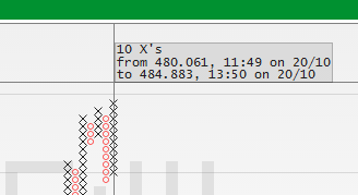
In the Style tab of the Design dialog there is an option called Show data values e.g. OHLC: if this is ticked and the crosshair is active ( button above the chart), a label will appear on the crosshair with information about the selected column. This will include the number of boxes in the column, the price range and the time range.
The behaviour of the time range options is different in P&F charts than it is in time-based charts.

Pressing the 1 year button in a candlestick chart will show 1 year of data but, as the amount of data shown on P&F charts is determined instead by the box size and the pixel size of each X and O, the time range option determines how much data is used to calculate the chart in the first place.
For example, the chart shown at the beginning of this tutorial shows a Point & Figure chart calculated using the share's whole daily history. If you then select 1 year the chart will look like the image below.
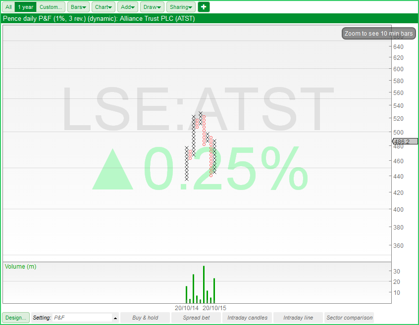
Note that whilst in other chart types (e.g. OHLC), clicking and dragging the cursor left or right on the chart will zoom in; on P&F charts it will move the chart in the direction you are dragging (left, right, up or down).
When using Point & Figure you can still use the  button to change the bar size, but its effect isn't as obvious as with a candlestick chart.
Changing the option from Weekly to Daily, for example, will change the number of data points used to calculate the chart, but this won't necessarily change the chart itself.
Let's look at a couple of examples on a 10 point, 3 reversal chart.
| Weekly Prices | Daily Prices | |
|---|---|---|
| Friday 1st | 101 | 101 |
| Monday 4th | 105 | |
| Tuesday 5th | 120 | |
| Wednesday 6th | 110 | |
| Thursday 7th | 125 | |
| Friday 8th | 130 | 130 |
In the first example above the chart wouldn't change: in both cases a column of 3 Xs will be drawn.
| Weekly Prices | Daily Prices | |
|---|---|---|
| Friday 1st | 101 | 101 |
| Monday 4th | 120 | |
| Tuesday 5th | 81 | |
| Wednesday 6th | 90 | |
| Thursday 7th | 140 | |
| Friday 8th | 130 | 130 |
In this second example the weekly chart will still be shown as a column of 3 Xs, but switching to daily will show a column of 2 Xs, followed by 4 Os, then by 5 Xs, ending one X above the weekly chart. These are obviously extreme examples but should hopefully illustrate the point.
Point & Figure indicators
Indicators and moving averages can be added to a Point & Figure chart and have exactly the same options as they do on time based charts.
As P&F charts don't have OHLCV data in the traditional sense, an alternative is used.
For each column of Xs or Os, the upper and lower values are taken as the high and low, whilst the mid point of the column is taken as both the open and close. The volume of any given column is simply the cumulative volume over its lifespan.
Point & Figure price targets
Point & Figure chart patterns can be used as the base to calculate price targets. ShareScope calculates and displays price targets based upon horizontal count patterns and vertical count patterns. Our approach to price targets is based on that in "The Definitive Guide to Point & Figure" by Jeremy du Plessis.
The description of these patterns is based upon 3-box reversal charts. The same methodology is applicable to any reversal size except 1 so ShareScope does not provide price target calculations on 1-box reversal charts.
The step-by-step methods described below are for bullish targets; bearish targets are calculated by employing the exact opposite methodology (O instead of X, highs instead of lows etc.).
You can add Point & Figure price targets to a chart by selecting the option on the Add menu in the Chart view.
Vertical Count Targets
- First a bottom is identified. This is a column of Os with a lower low than both the previous and the following column of Os. In the image below, all bottoms have been marked with a red arrow.
- Next, the "Establishment" column is identified. This is the column of Xs immediately after the bottom.
- The price target is calculated.
Vertical Count = (Number of Xs in the establishment column) x (reversal)
For example: in the 3-box reversal chart above the establishment column of the first pattern is 10 Xs tall, so the price target is 30 boxes above the low of the column marked by the first red arrow. - Activation or negation of the price target. A price target is considered to be "active" as soon as the high of the establishment column of Xs is breached. The 3 activation points of the 3 patterns in the image above have been marked with a blue circle.
On the other hand, if the low of the column of Os forming the initial bottom is breached, the price target is "negated" and regarded as invalid.
There is no time limit for an activation or negation trigger to happen: a particular target will be activated or negated based on which of the two occurs first, even if this is many columns into the future. So once a column is active, it can't be negated and vice versa. Negated targets are not shown on the chart.
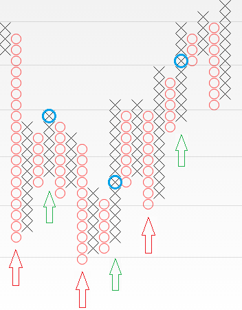
The earliest point at which a target can be calculated is when the column of Xs following the establishment column is started (marked by a green arrow on the image). Once this column of Xs appears on the chart, the preceding column of Os is completed, which means that the bottom marked by the red arrow can be unambiguously identified.
Horizontal count targets
This method of creating price targets requires the identification of a specific pattern from which the target can be calculated.
What constitutes a valid pattern is open to debate. We have been conservative with this interpretation: we'd rather miss some patterns which could be considered valid, than risk identifying spurious ones.
Identify a congestion pattern bottom
- Identify a long column of Os which is at least 4 times reversal in length (4 is the default, but this can be changed) and which forms a lower low (lower than the previous column of Os).
- Count the number of columns to the right of that until either a long column of Xs is identified which meets the following conditions:
- At least 4 times the reversal value in length.
- At least 75% of the length of the column of Os.
- The lows of the two columns must not differ by more than the reversal value.
- The high of the column of Xs must be as least as high as the column of Os less the reversal value.
- If the high of the column of Os is breached by a column of Xs which doesn't match the description above, the pattern is null and ignored.
All columns in between must be shorter than the two main columns.
On visual inspection, the final pattern should be a U, V or W shape.
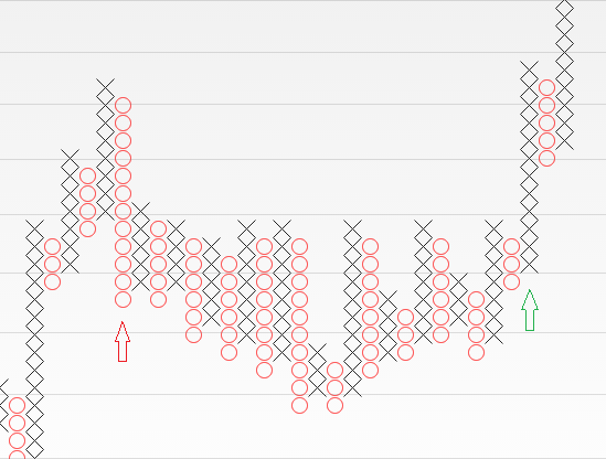
Example (1% box, 3-box reversal)
- First column of Os (red arrow) is 12 boxes long (4x reversal) and its low is lower than the previous column of Os.
- 22 columns are counted before a long column of Xs is found (green arrow).
- The column of Xs is 12 boxes long (4x reversal and its low is no more than 3 boxes from the low of the column of Os.
- The column of Xs is higher than the column of Os.
- All 22 columns in between are less than 12 boxes long.
- This is an almost perfect example of the U shaped pattern the book is describing.
Calculate the price target
- Count the number of columns in the pattern including the entry and exit columns.
- Multiply that number by the reversal to reach the price target.
- Count up from the lowest low of the pattern.
- As opposed to the vertical count the horizontal count has no activation trigger. If the target price is inside the two main columns or, when looking at bearish patterns, the target is 0 or less, the pattern is ignored and not drawn.
Price Target Options
When you select P&F price targets in the Chart view, the following dialog is displayed.
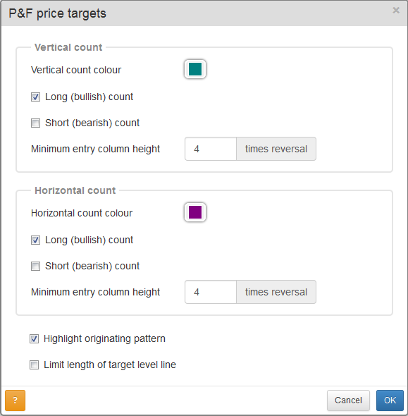
Vertical count
- Vertical count colour - Colour for vertical counting
- Long (bullish) count - Enable bullish targets on the instrument
- Short (bearish) count - Enable bearish targets on the instrument
- Minimum entry column height - Determines the shortest allowed length of a pattern's entry column. This value is a multiplier of the reversal.
Horizontal count
- Horizontal count colour - Colour for horizontal counting
- Long (bullish) count - Enable bullish targets on the instrument
- Short (bearish) count - Enable bearish targets on the instrument
- Minimum entry column height - Determines the shortest allowed length of a pattern's entry column. For horizontal counts this also determines the shortest allowed exit column. This value is a multiplier of the reversal.
General
These options apply to both vertical and horizontal count methods.
- Highlight originating pattern - will highlight the pattern from which the target is calculated. If this is left unchecked only the price target is shown.
- Limit length of target level line - will limit the length of the horizontal lines drawn from the target level. If left unchecked, a horizontal line will be drawn from each target infinitely into the future or until the target is hit.