Outperforming an Index
In this tutorial, we explain how you can identify shares which are outperforming a particular index over a specified period of time.
You display the relative performance of an instrument in one of three ways:
On a chart
The first thing to do is to create a chart setting that shows the performance of the instrument against the chosen index. For this exercise we'll use the FTSE 100.
We'll start by creating a new graph setting. To do so, click on the Setting menu and then select Create new... from the menu.
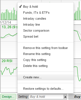
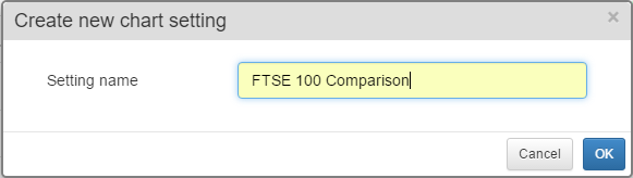
When prompted, give the setting a name of your choice. Here we have called it "FTSE 100 Comparison"
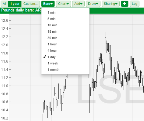
The default chart shows one year's price history using daily OHLC bars.
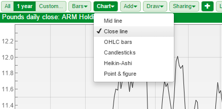
As we want to compare two separate instruments, it might be easier to change the chart type from OHLC bars to as close line.
To change the chart, simply click on the Chart button and select Close line from the menu.
To add the FTSE 100 chart, click on the Add button and select Additional charts.... In the following dialog, select FTSE 100 index from the drop down menu and then click on the Create button.
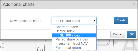
Select a colour for the FTSE 100, leave the option on Share price and click OK.
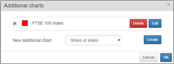
To confirm your changes, click OK on the Additional charts dialog.
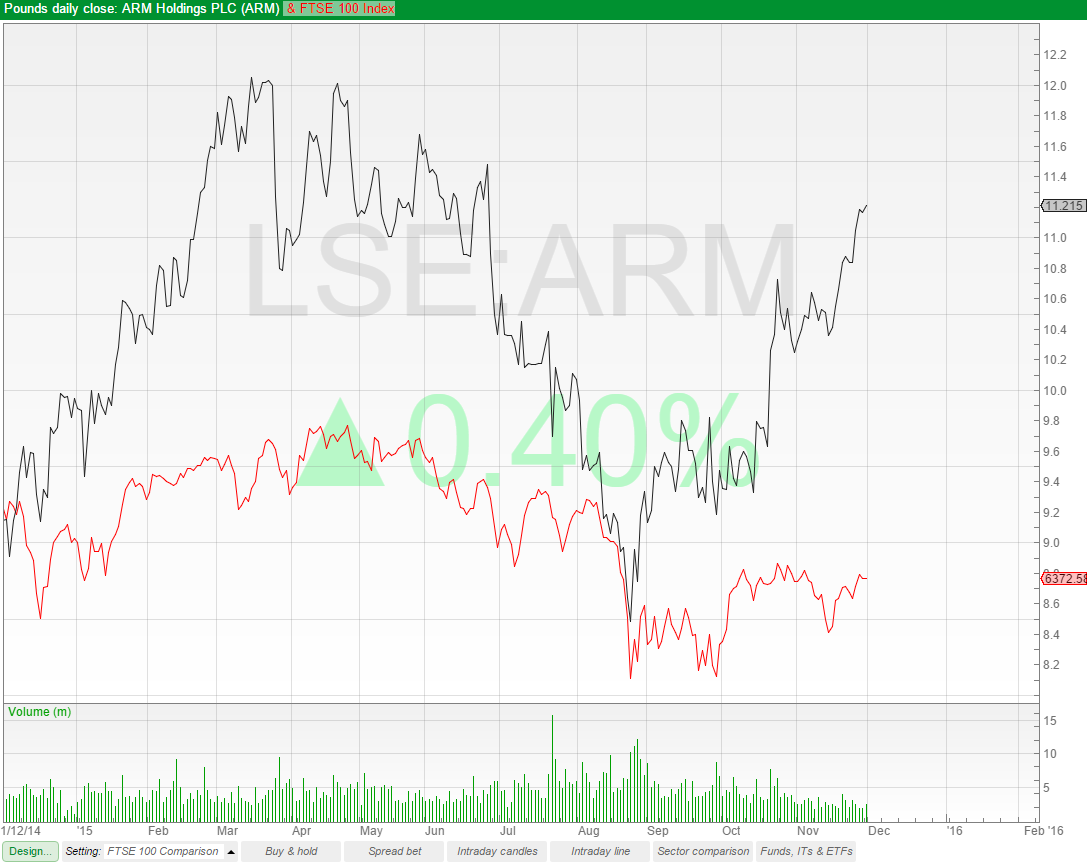
In the above example, you can see the FTSE 100 has been applied to the chart. On the left-hand side of the graph, you can see that the FTSE 100 is rebased to the same price as the share at that particular point in time.
The ratio calculated to do this is then used to re-plot the FTSE 100 (without this, the FTSE 100 would be far off of the top of the chart)
You can see the current value of the share and the FTSE 100, but it is not possible to make a direct comparison between the two.
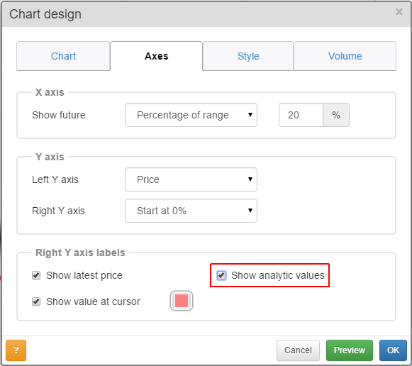
To make a more meaningful comparison, we need to express the right hand axis as a percentage. To do this, click on the Design button at the bottom left-hand corner of the screen.
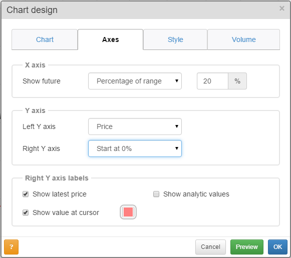
In the Design dialog select the Axes tab. Change the Right Y axis option to Start at 0%. We have also changed the Left Y axis to Price so that you can still see the price of the selected share. Click OK when you are happy with your changes.

Now you can see that over the range of the chart, which is a year, the FTSE 100 has fallen by 4.447% whilst Arm holdings has risen by 22.283%.
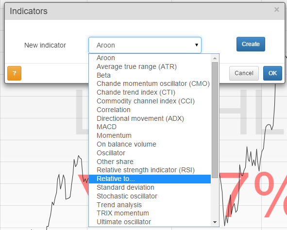
We can also add a Relative to indicator to the chart which shows us performance of the stock against the comparative.
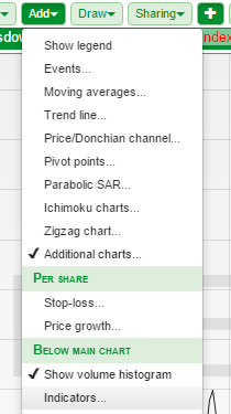
Click on the green Add button and select Indicators... from the bottom of the menu. From the following Indicators dialog, select Relative to... from the drop-down menu and click Create.
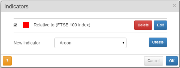
If you wish to change the comparative instrument or the line colour, click on the blue Edit button, otherwise just click OK.
You may also wish to select Design and then the Axes tab and tick the option Show analytic values.
Once you have done this you will end up with an indicator that shows the Relative to calculation between the currently selected share and the comparative instrument.
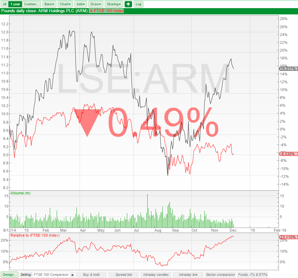
Note: The Relative to calculation is not simply the difference between the performance of the two instruments.
On a table
We can also display a share's relative performance as a column in a table.
To begin, click on the Add Column button (note: if you have a column selected, this button is labelled Add).
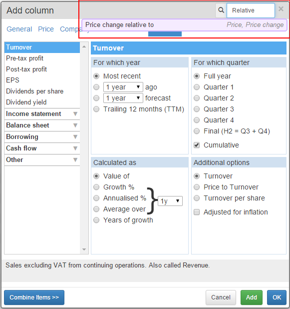
At the top right of the Add Column dialog window search for the term "relative". This will display the option Price change relative to. Selecting this will display some new options:
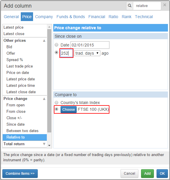
The Price change relative to column has two sets of options; Since close on and Compare to.
In the Since close on we have changed the number of trading days ago to 252. We use 252 trading days to represent a year as the number is easily divisible by 12.
In the Compare to section we have left the option on the FTSE 100 although you can click on the Choose button to select a different instrument to compare against.
To confirm your selections, click OK.
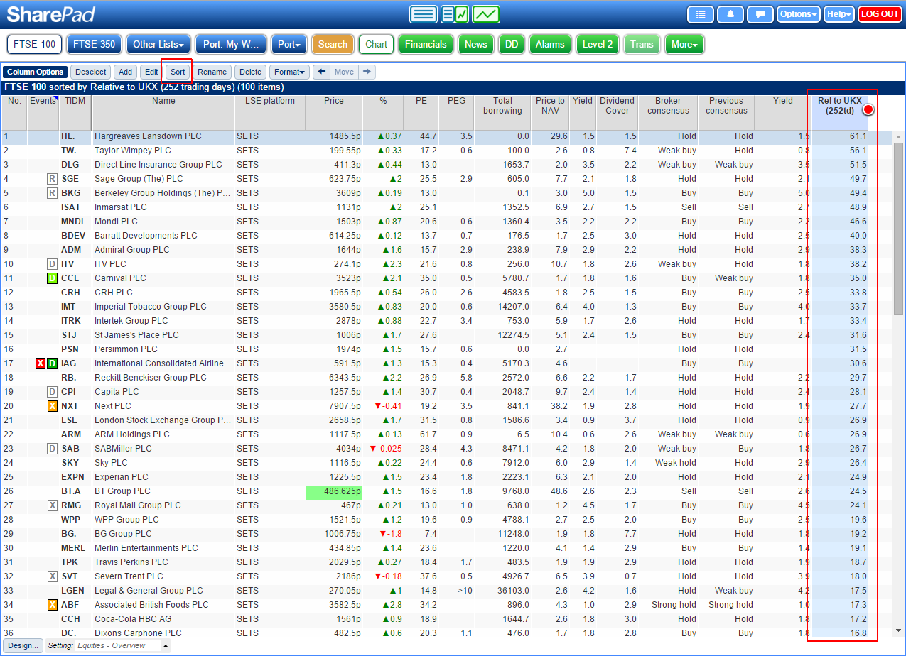
Once added, select the new column and click on the Sort button.
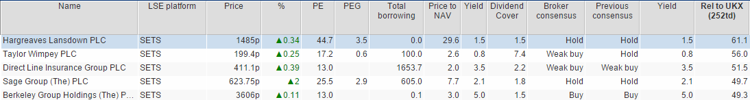
Here you can see the top five FTSE 100 stocks that have outperformed the FTSE 100 index over the last year.
In a filter
You may wish to view stocks that have outperformed an index by a specified percentage over a given period of time. This is where filtering comes in.
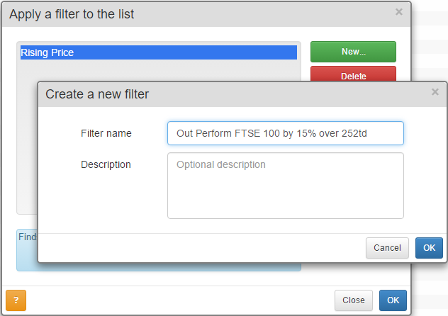
To illustrate, we will look for share which have outperformed the FTSE 100 by at least 15% over the past 252 trading days (a trading year).
Click on the blue Filter button and then Apply filter...
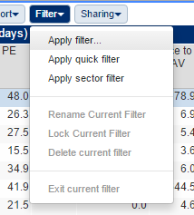
Click on the green New button and give the new filter an appropriate name. In this example, we have called it: "Out Perform FTSE 100 by 15% over 252td".
Once you have named the filter click OK and then OK again to select it.
Click on the  button.
As we did in the Lists section; search for "Relative", select the Price change relative to option, change the number of trading days ago to 252 and click on OK.
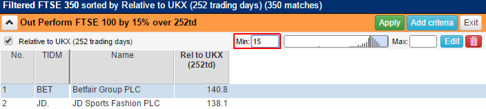
Set the minimum % performance value, in this case 15, and click on the green Apply button.
This criterion can be used as a filter in its own right, or if you prefer, added alongside other criteria for a more complex filter.
The Price Relative to feature isn't just confined to the FTSE 100 or stocks however. In the example below, we've used the FTSE 350 (EPIC: NMX) as a benchmark.
