Tutorial: Japanese candlesticks
The most common methods of displaying data on a graph are displayed below:
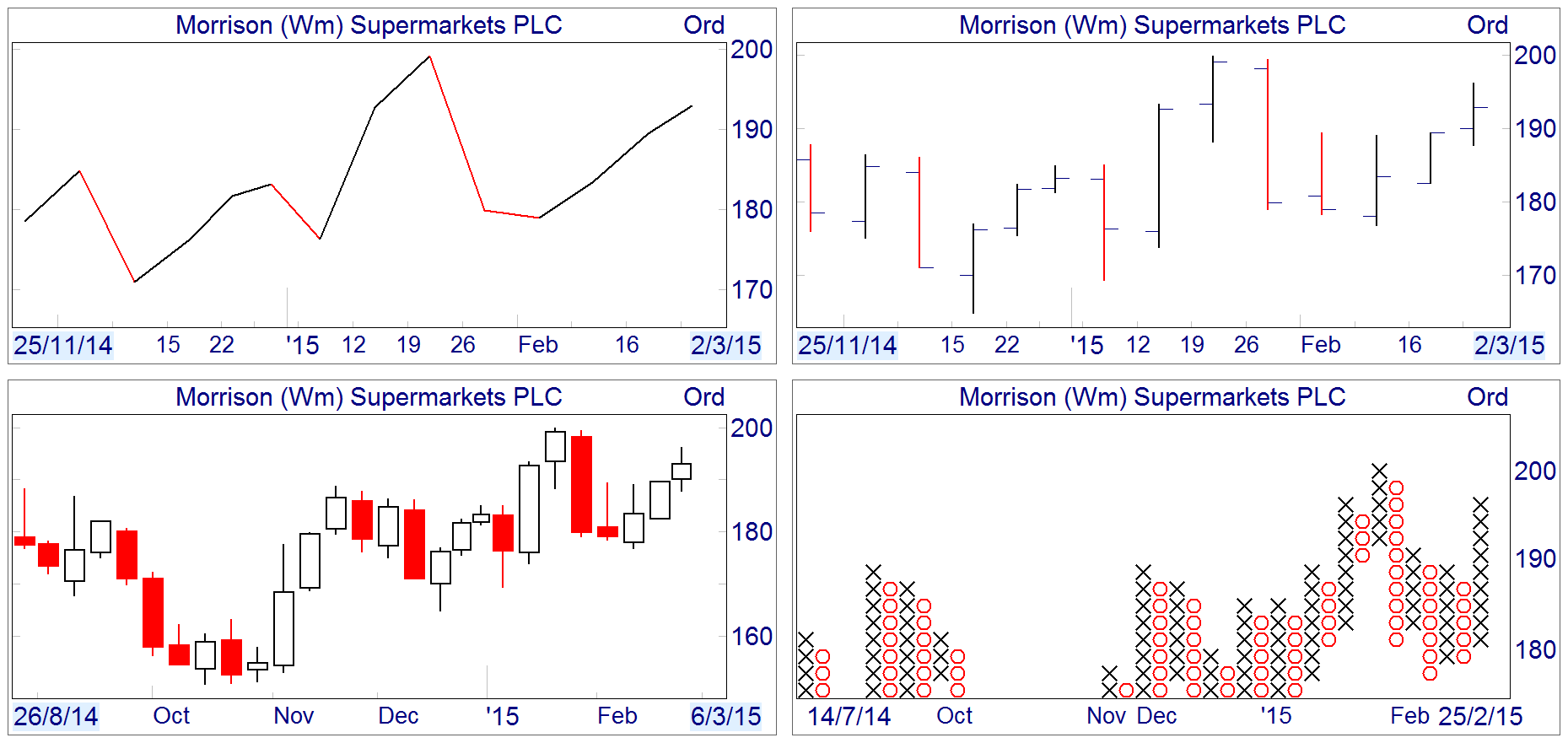
Clockwise from top left the charts show a Close line, Bar Charts, Point & Figure and Candlesticks.
In this tutorial we will look at some basics of Japanese candlestick chart analysis. "Candlesticks" or "candles" were made popular in the early 1990s by Steve Nison, author of Japanese Candlestick Charting Techniques and are an alternative method of displaying Open, High, Low and Close data.
Drawing Candlesticks
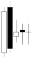
Candlestick charts are so called due to their resemblance of candlesticks. The main section of the candlestick is called the real body and shows the range between the Open and Close. The "wicks" or lines at the top and bottom of the real body are called the upper and lower shadow and represent the high and low values.
- Traditionally candles are drawn either hollow or filled.
- A hollow candle shows that the Close of the session is higher than the Open.
- A filled candle shows that the Close is lower than the Open.
 |
A hollow candle opens near the low and closes near the high, showing a bullish trend for the session. |
 |
A filled candle shows the bears in charge as the instrument opens high and closes near the low. |
 |
Candles come in all different sizes - a long candle shows one-sided action where a short candle may indicate a loss of momentum. |
 |
A candle can also have a shaven head or shaven bottom - where there is no shadow at the top or bottom. |
 |
If the real body is small then the candle is called a spinning top. |
 |
A doji is where the Open and Close have the same value (or are very close). |
When viewed together on a chart these candles can form reversal or continuation patterns - some of which we will look at later in this article.
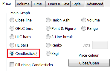
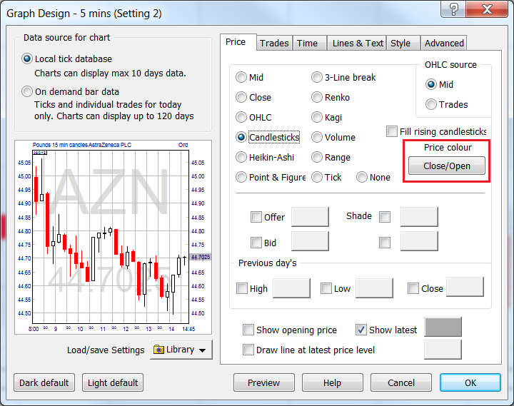
To display candles on your graphs in ShareScope, right click in the graph and select Graph Design. On the Price tab select Candlestick.
Historical Graph Design dialog:
Colouring Candlesticks
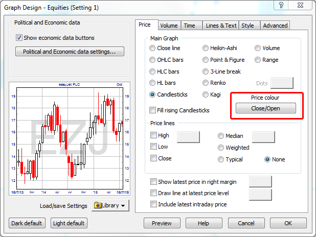
By default ShareScope will draw candles as either being filled or hollow depending on the Open and Close, however there are a number of different colouring options available to you. To access the colouring options, click on the Price colour button on the Graph Design dialog in both the Historical and Intraday graphs.
Historical Graph Design dialog:
Intraday Graph Design dialog:
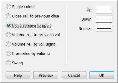
Price colour options:
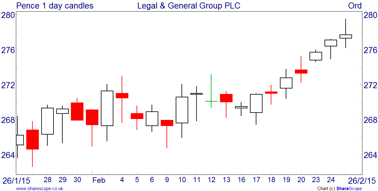
The traditional method of drawing candles is based only on the relationship between the Open and Close - an "up" candle is a hollow candle and a "down" one is filled. The following chart shows that all filled candles are red and all hollow candles are black. The green candle clearly shows a doji.
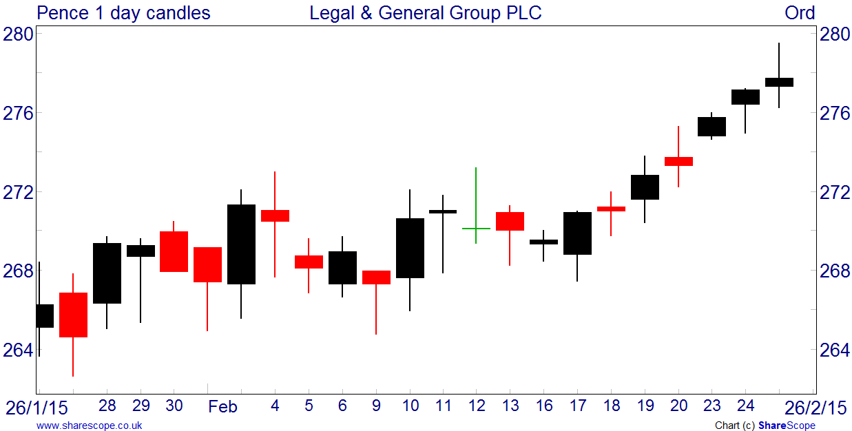
The chart below shows the same price action, however this time the "Fill rising Candlesticks" option in Graph Design has been selected. Some users prefer all the candles to be filled as it can make reading the graphs slightly easier - in this instance it is just the colour that will identify an up or down candle, so make sure your Price colour options are set to your requirements.
Candlestick Patterns
Various combinations of candlestick types are taken to indicate price reversal or continuation patterns. Here are some examples:
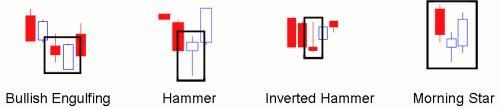
Bullish Patterns:
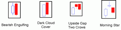
Bearish Patterns:
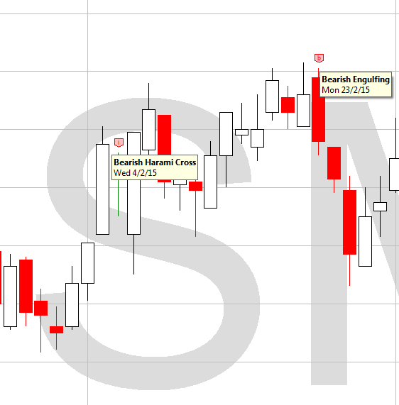
ShareScope Plus and Pro can identify a number of these patterns on the Historical price graphs. The chart below shows an Engulfing pattern (b) and a Harami Cross (i).
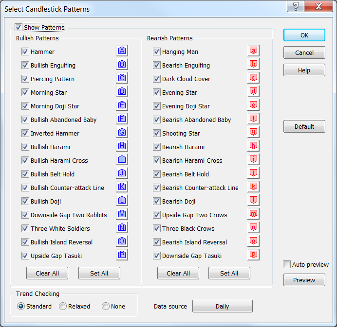
The dialog below shows the patterns that can be identified by ShareScope Plus and Pro.
Remember, if you have any trouble finding or using any of these features, please don't hesitate to contact our Customer Support team. They will be delighted to help.